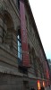
A closer look on the GRUT 1931 Chocolate

Jul 30, 2014,01:58 AM
 

Friends,

Not long ago I had the chance to see the RG/Chocolate in real.

When I first saw the press photo of this watch I was over the Moon!

After seeing the watch in real I am still under its charm, no doubt about that. But… Yes, there is a but here…

The fact that it has a sub-second do not bother me, I am used to that from other Reverso’s…

The fact that there is no logo on the dial, no problem…

The fact that the Rose Gold case has the same dimensions as the Red, na, that’s not it….

The fact that “Reverso” is located above the sub-second, I can live with that…

But, what do bother me is the thickness of the white minute track and even more the white lines around the indexes!

IMO, the white lines are too thick. Not sure if it is because of the dark background…. But they feel much more pronounced than on the Blue or the Red.

What I think is much better is the strap. The leather quality is much higher than on the black strap that came with the Blue from the same strap maker. Not sure if it is only on the straps I saw or different quality depending on color of the leather…

I wouldn’t say that the white lines are a deal breaker for me, but I was not as stunned by this piece as I thought I would be.

But then again, once on the wrist – Eh, what white lines…?

wink


Best

Blomman

This message has been edited by blomman on 2014-07-30 02:00:00

  login to reply

Comments: view entire thread


Thanks Blomman for these shots

 
 By: 4Js : July 30th, 2014-03:43
I have not had a chance to see any of these new pieces from JLC. I bought the rouge and bleu sight unseen, banking on the photos of our various purists. I was not disappointed when they arrived to me from the boutique. I just got the chance to view some r... 

Tough question, Joe...

 
 By: blomman Mr Blue : July 30th, 2014-13:01
I think it's a matter of taste... Are you a RG person? Do you already have a silver dial/sub-second Reverso? If you don't have a white/silver dialed Reverso, eventually you will miss it! On the other hand, will you ever get another shot of having a brown ... 

Your assessment does make a lot of sense.. Choc dial nice.. Strap superb ! :)

 
 By: hs111 : July 30th, 2014-04:32
<br> - I can just say, that this strap in middle brown Cordovan has a stunning look & feel<br> I've mounted it on my TTR 1931, and am totally happy with it <br><br> Overall, IMO the Choc dialled Reverso in PG is a nice ad-on to...  

The blue would be a great companion for....

 
 By: blomman Mr Blue : July 30th, 2014-13:05
You and your Reverso's, my friend! :) Yes, the brown strap I must confess I really like, maybe I should order one. Wonder if it would go with the blue...? Best Blomman

I thing you're right on about the white around the indices

 
 By: watchthatman : July 30th, 2014-04:49
It may be there's not adequate contrast between the chocolate face and the gold indices on their own, but I'd love to see something without the white. I'm not convinced the minute track is thicker, but will look at the photos again later. It seems the whi... 

The lines jump when you look close...

 
 By: blomman Mr Blue : July 30th, 2014-13:09
From a distance not that much, but still... IMO. Maybe I am sensitive, I had the same feeling about the TT Polaris 68 in the beginning... Not any more! Best Blomman

Hmmm... the white lines do look a bit pronounced in some pics. But I believe that...

 
 By: Ruckdee : July 30th, 2014-06:38
...they will not bother me in real life once on wrist. Thank you for the live pics. They show some things that the PR shots don't. And I haven't seen this one in the real yet. Ruckdee

Hope you will see it soon, Ruckdee!

 
 By: blomman Mr Blue : July 30th, 2014-13:10
It is a beauty! Even with the white lines... ;) Best Blomman

I had not noticed

 
 By: respo : July 30th, 2014-06:43
I had not noticed the white lines until you pointed them out, Blomman. But it seems not too distracting to me. Really, I have a hard time choosing among these growing variations on the GRUT 1931 Reverso + 1948 + Bleu Duo. JLC is not making things any easi... 

That IS always the best solution! ;)

 
 By: blomman Mr Blue : July 30th, 2014-13:13
Na, seriously, I agree - it's hard to keep up with all the different versions that has been released since 2011. I find the Blue very handy since it has two great dials and the GMT function! :) Best Blomman

We are picky, very picky, my friend.

 
 By: amanico : July 30th, 2014-11:03
But you are right, some détails may not please us. That is why the " in the real " experience is so important. Though, I still think it is a piece full of charm. All the best, Nicolas

Yes, full of charm! :)

 
 By: blomman Mr Blue : July 30th, 2014-13:14
But of course, we SHOULD be very very picky! Who else will....? ;) Best, my friend Blomman

Then there is this curious design decision:

 
 By: LouS : July 30th, 2014-11:47
Luminescent hour indices but with non-luminescent hands. Yes, I know it is a luxury piece of jewelry that we are unlikely to depend on in the dark, but still - sometimes the people in the design office drag things a little too far from actual usefulness. ... 

I didn't have the chance to see...

 
 By: blomman Mr Blue : July 30th, 2014-13:16
The watch in the dark so that didn't bother me, but it would if it was laying on my nightstand... Best Blomman

It's definitely tough to be in the luxury goods business...

 
 By: Echi : July 30th, 2014-23:50
as pleasure is either derailed or derived from the smallest details! imagine that almost-buy situation that just falls apart because of something like thick borderlines around the indices. i didn't notice it, btw, until you showed the pics. but then i won...